Here is where you will find all the projects that I did in Mrs. Powers' Design class of 2014!
Project #1

Title: Old Man
Course: Design
Teacher: Mrs. Powers
Subject Matter: Drawing/ Sketching
Mediums: Sketch pencils
Project Goal: Draw the old man in the picture that Mrs. Powers gave us
Course: Design
Teacher: Mrs. Powers
Subject Matter: Drawing/ Sketching
Mediums: Sketch pencils
Project Goal: Draw the old man in the picture that Mrs. Powers gave us
This project was different than anything in the class that we had done before. We had a picture of an old man given to us and we had to draw him using sketch pencils. For this project I didn't really plan anything, only drew. While I was drawing I did use a couple elements of design. Some of these were lines, texture and space. Lines were used in his shirt, his glasses and his face. They created the solid parts of his face and of the picture. The lines in his face also created Texture. The lines were used to make wrinkles (the texture) in his face making him appear old and frail. The next element was Space. Space was used when I made the middle of his face lighter and the sides darker, creating a more real face like look. The light looks as if it is hitting the parts that are farther out in the old mans face and they are darker in spots not getting the light.
Not only did I use elements of design but also principles. Some principles that I used were contrast and unity. The Contrast comes when you look at the colors. I was only using sketch pencils so they were only different shades of gray. This makes the white contrast the darker colors in his face, clothing and background. Contrast and unity may have a totally different definition, but they are both used in this picture. Unity is used in the shading. Everything flows together to made a soft appearance. This is what makes the old man seem old, wrinkly and soft. The unity between the colors makes a whole difference.
This was the first thing we had to do this year. Last year we did the same exact thing except with a tiger. I think my drawing was very good. It looks like a real person and I am proud of it. If I did fix some things they would be the nose, neck and upper body. His nose has a weird look to it, it is too small or something. I would make it bigger if I redid this project. I would also proportion his body and neck better to his head, making his neck larger and his body smaller. Overall I think this was good for just coming into the class.
Project #2
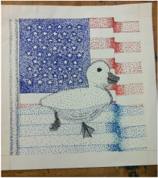
Title: Freedom Duckling
Course: Design
Teacher: Mrs. Powers
Subject Matter: Pointillism
Medium: Markers
Project Goal: Create an image using only stippling making the main focus black and white and the background in color or vice versa.
Course: Design
Teacher: Mrs. Powers
Subject Matter: Pointillism
Medium: Markers
Project Goal: Create an image using only stippling making the main focus black and white and the background in color or vice versa.
To plan for this project I started out by measuring the flag and doing ratios to up size the flag to fit the paper. By doing this I keep the flag proportional. This involved using lots of Lines. For this project I used a couple of the elements of design. Some of these were: Line, Value, Color, Space, Shape and Texture. The lines as I said earlier were used a lot in the planning process, but this is not so much with Value. Value was used in the stippling along with the Color. Around the sides of the pole I had to use Value by making the Color darker. I also did this with the rippling flag. Where the flag is waving it is darker to show the Value of it. By doing all these things it definitely brought out the Space in the artwork. Part of the flag is behind another part and the duckling is in front of the flag. These all show it and also show Shape. Shape is mostly found in the flag pole where you can tell by the darker Colors around it and the Value in it that it is a cylindrical Shape. This leaves me with the last element: Texture. In the duck there is some Texture found on the underneath part of it and the outsides. The duck is fuzzy and the bottom has some ridges kind of showing where the feathers and water are going against each other.
In this piece there is not only the elements of design, but also the principles! A couple of the principles that I used were Balance, Movement, Emphasis and Contrast. Balance comes in when you look at the symmetry of the flag. The lines are all symmetrical and therefore there is balance between them. The next one I used was Movement. Movement is shown where the water is waving and the ducks foot is behind the other making it appear as though the duck is swimming through the water. With the duck in mind, the next principle comes in: Contrast. Contrast is shown between the colors I used. The duck is black, whereas the flag is colorful. This brings me to the least principle that was used: Emphasis. Emphasis is shown when you look at the different colors between the duck and the flag. The flag is in colors, while the duck is in black. This puts Emphasis on the duck making it stand out more in the picture. This was the main idea of the project, to use black in either the object or the background and use color on the other.
On this project I definitely don't think it was my best work, but I did try hard to do a good job. If I took a little more time making the dots look better or more of them it would have improved the project greatly. Though, I did run into some problems. At first I did not measure the paper correctly because I was not keeping the border in mind, so that messed up the appearance of the flag and I had to start that over. I also could NOT get the right colored markers that would last long enough for me to do all the dots I needed. That was the biggest problem. In the beginning I was thinking about doing an American Eagle as the bird in front of the flag, but then on a second thought I said no, that is too normal. So then the duck came to mind. Like hey, why would a duck be swimming in front of a flag? Nobody knows and the answer can be different for every individual person that looks at it. That is the beauty with every single piece of artwork! One thing that people might think is weird is how the bottom half of the flag is blue. This just is showing that the flag is in the water. It could be perceived in many different ways, but this is the way I intended it.was waa F Fffff Movement i
Project #3
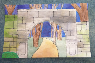
Title: The Mossy Arch
Course: Design
Teacher: Mrs. Powers
Subject Matter: Water Painting
Medium: Water Paints
Project Goal: Show value using water color
Course: Design
Teacher: Mrs. Powers
Subject Matter: Water Painting
Medium: Water Paints
Project Goal: Show value using water color
To plan for this project it involved finding a picture that shows perspective. The next step after finding the picture was drawing the picture on the water color paper. Getting the wall to be about the same as in the actual picture was a little bit tricky. This project also used the elements of design. These were Line, Shape, Space, Value,Color and texture. Line was used in making the bricks and the trees. Each brick is made out of lines. The lines are making Shapes, the shape of bricks. Therefore by using lines I created shapes also. The bricks had to take up Space. Space can be seen in the cracks of the bricks and in between the bricks. Since you are looking the arch straight on, you can not see any other side of the bricks other than the front and this may create a flat appearance, but I tried to add Value to show their shapes better. The Color in this picture can show a lot. The green on the bricks is supposed to be moss which can create Texture in the picture. Moss is known to have a fuzzy feeling so hopefully that can be imagined when looking at my painting.
In this picture there were principles of design also. Some that I used are Pattern, Scale and Emphasis. Pattern is shown in the bricks. They are placed in a loose pattern putting the end of one brick near to the middle or the end of another brick. Scale is also used in bricks. The bricks have to be larger than they should compared to the tree because they are closer. Also the Emphasis is used here again on the bricks. It is shown in the bright green color of the moss, emphasizing on the arch. This makes the arch stand out and be the main view of the picture.
This project was some decent work. I feel like I could have done better on the road and the trees to make the picture look more realistic. As the road went farther back it got smaller, but it did not get darker. This is what should have happened and there should have been a more bumpy look to the road also. It is a dirt road, so it is too smooth in the painting. Some problems that I had were in the color of the paint. I would start on the project one day and then come back to it the next and not be able to create the same look with the colors. Also another problem I had was when I was about to start using the Sharpie pen I was very hesitant and felt like it wouldn't look good on my project. Being hesitant really made me un-confident in my work and I think it turned out a bit sloppy. Doing the project over again I would have used different colors and better Sharpie markings, I think this would have made the world of a difference.
Project #4

Title: The Starry Siesta
Course: Design
Teacher: Mrs. Powers
Subject Matter: Acrylic Painting
Medium: Acrylic paint
Project Goal: Pick a famous peice of artwork and paint it in your own style
Course: Design
Teacher: Mrs. Powers
Subject Matter: Acrylic Painting
Medium: Acrylic paint
Project Goal: Pick a famous peice of artwork and paint it in your own style
To plan for this project, I first had to pick a famous piece of artwork by a well known artist. The artist I picked was Vincent Van Gogh. I decided to incorporate two of his more famous artworks into one single piece of art. The two pieces I used and made my own were The Starry Night and The Siesta, this is why I named it: The Starry Siesta. In The Starry Siesta I used some elements of design. A couple of the ones I used were line, texture and color. I used Line by turning The Starry Night into my own and making the lines thicker than in the original painting. This was to make it my own, but it didn't look very good like I thought it might. Another element I used was Texture. Texture was used in the sand and in the water. I put lighter colors in the sand to show where bumps were making it look more like a hill of sand. In the water I used curved brush strokes so that the water looked like it was moving. Something that helped with texture was Color. The color made some parts lighter and others darker. There was color in the whole thing, there was not supposed to be any white from the board left showing.
Not only did I use elements, but also the principles of design in my project. A couple of the principles that I used were contrast, balance and repetition. Contrast was shown in the sky. The blues greatly contrast with the yellow stars. This makes the stars stick out in the sky more than they would if they were a darker color. The next principle I used was Balance. Balance is shown in the size of the people and the hill. The people are not too big and the hill is not too small. This creates a balance between them. The last principle was repetition. Repetition is in the strokes in the sky. I used the different colors in the strokes to make them stand out and each stroke was about the same length and size. This is repetitious.
My personal thoughts on this project was that I didn't like the final outcome. The sky did not look good like I thought it would, and the sand did not have enough colors in it. I was exited to see how it would come out, but in the end, it really didn't. If I redid this project, I would blend in the sky and add some more colors. Overall, I was not proud of the final outcome.
Project #5

Title: A Mushroom Morning
Course: Design
Teacher: Mrs. Powers
Subject Matter: Print making
Medium: Ink
Project Goal: Print six good stamps and mount them
Course: Design
Teacher: Mrs. Powers
Subject Matter: Print making
Medium: Ink
Project Goal: Print six good stamps and mount them
Planning for this project was kind of hard. I had to first find a picture that I could turn into a stamp. After I found a lot of possible pictures, I had to pick one that I could do, but wouldn't be too hard. So I picked the mushrooms! From the original picture I changed the caps of the mushrooms putting more on them to add to the stamp. In the stamp I used the elements and principles of design. The elements I used were line, shape and texture. Lines were used to make the stems and the grass in the stamp. For the grass it was just a lot of lines some connecting to be wider at the bottom and the stems were connected to the caps of the mushroom making the bottom of them smaller too. The next element, Shape, was used in the shapes in the caps of the mushrooms. The prints show shapes in the caps making it look better than just a plain mushroom. This was not only shapes, but Texture too. The shapes make it look like parts stick out farther than others looking like it would feel that way too. The lines underneath the caps also show texture. When you feel mushrooms you can feel the underneath part and it has the most distinct feeling, so by putting that in the print its a texture.
Now for the principles of design. The principles that I used were contrast, dominance and scale. Contrast was used in the colors. The color of the ink would contrast in the color of the paper. There was only one print that did not contrast and that was the white print on grey paper. Dominance is when you look at the mushrooms and the biggest one stands out. That is the dominant part of the print. This also leads into Scale. The scale is how the grass is not too long and none of the mushrooms are majorly large or small compared to another one. They are all scale to fit together.
My personal thought on this was i really liked it. The colors that I chose stood out against each other or they went with each other. The top prints I did black on white, white on grey and grey on black so they all went together. For the bottom prints I chose two bright colors and a dark color that would stand out or make the other prints stand out. If I had to redo this project i would have added more to the background of my stamp. It is very blank in the background and I could have put some bugs flying around or a sun rising. Overall I think it was a good project for me.
Project #6
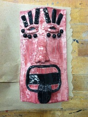
Title: Fu-Ju-Ki
Course: Design
Teacher: Mrs. Powers
Subject Matter: Clay Modeling
Mediums: Clay and Glaze
Project Goal: Create whatever project you want that is approved by Mrs. Powers by using clay
Course: Design
Teacher: Mrs. Powers
Subject Matter: Clay Modeling
Mediums: Clay and Glaze
Project Goal: Create whatever project you want that is approved by Mrs. Powers by using clay
To plan for this project I had to choose what I wanted to create with the clay. I looked up a lot of clay projects and things and I finally found a clay tiki mask. I decided to make my own version of the tiki mask. On this project I used the elements and principles of design. Some of the elements I used were line, texture, shape and color. I used Lines on the teeth and the things above the eyes to create a straighter appearance and make the mask look better. I also used a line with a curve at the end underneath the eyes just to add some Texture. Texture was also shown on the sides (which is hard to see in the picture) where I put scratch marks on it. Three going sideways and then three up and down. Next was Shape. The whole thing was a shape technically, but the things that showed the most shape was the balls underneath the eyes, the tongue and the strips above the eyes. One of the last elements that I used was Color. I only used two colors in this project and they were black and purplish/red.
Next comes the principles of design. Two that I used were repetition and contrast. Repetition was used in the balls underneath the eyes being the same shape and size every time. Also the lines as the teeth were also spaced pretty evenly. The next thing, Contrast, is used when you look and see the black against the purplish/red color. This makes some things pop out. The tongue, lips, balls beneath the eyes and the strips above the eyes all really pop out because of the differences in colors.
I think this project was one of the more fun projects that we did in Design. Everyone had complete freedom to make whatever they wanted and that made it a lot better. It gave everyone freedom and it was kind of like a break. This is my favorite project of the whole year. If I were to do something differently I probably would have made the mask better shaped. The bottom was hard to get curved and it was not even in some places. With the right stuff I probably could have curved it better. The only other thing I can think of that I would change is making it a little bigger. Other than that, I really liked it!
You can go back to the homepage, or click the lower button to check out some of my latest sketches!
